Category: Design

  • Build Your Product Strategy using this Blueprint

    Build Your Product Strategy using this Blueprint

    If you want to switch from waterfall and are new to agile there are many resources and blueprints available to get started and to tell you what to do next. There are courses to take and books to read and experienced people to learn from on how to build, test and ship software in iterative and continuous way.

    But what about all the activities that we do to decide what to build? Is there a blueprint we can follow on what to do next so we can make informed decisions on what to build? If you are like me, you have come across all different methodologies like Design Sprint, Jobs To Be Done, Lean Startup, Customer Development and Design Thinking over time and the question is, how do we know if these tools are helping us, and how do we know what to use when? How do I decide which ones are right for my team?

    I came across a (long) blog post followed by a video of Teresa Torres that answered all the above questions. Take a look at the video:

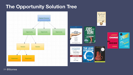
    In Summary, her idea is to build a decision tree (she calls it Opportunity Solution Tree) to make sure that we have thought about different aspect of what to build. The root starts with finding what the clear desired outcome is. We need to define a qualitative objective, combined with quantitative key results, so that we can measure if we are getting closer to our desired outcome. Next comes as identifying opportunities (which is the fancier word for problems and pain points you want to build solution for) and only after these two levels are clearly defined you can compare and categorize solutions and ideas to see if they tie back to the making better outcome.

    The great thing about Opportunity Solution Tree is that it gives you the blueprint I was craving earlier. This means there is a systematic way to use different methodologies at each levels to identify the problems/opportunities, solutions and validate if the proposed solutions will work. This is helpful to me because it it helps me to identify which method to pick. Take a look at this diagram here. In a glance I can now see Jobs-To-Be-Done more focuses at defining the problem but tools like design sprint talks more how to build the solution.

    One final note is like Agile concepts, I think this mapping concept is easy to understand but hard to implement. I am trying this at work right now I will let you know how things go!

  • Book Review: Badass – Making Users Awesome

    As you can see from my resource page, I am a huge fan of Kathy Sierra, so as soon as I learned she has written a new book I grabbed a copy and I was blown away. Kathy uses her distinctive style of using people with bubble talks to breakdown and explain complex stuff in easily understandable and fun way. However don’t be fooled that with all the white space, pictures and bubble speeches the book is easy or a fluff. Instead it is packed with lots of material on cognitive science and leaves you with many ideas on viewing your product in a totally different way.

    Making Users Awesome compromise of two different sections. 1. what is the reason that we use one particular product or service over other similar choices and 2. how we build skills over time and what are the ways we can accelerate learning skills over a short period of time.

    On part 1 the book’s main argument is that people pick a tool or service over others when they trust the recommendations they get about that particular product or service. When a friend or a family member talks to us about a recent app or a product they have used or when we pour over guests testimonial on Airbnb, we are likely to pick products, apps and hosts based on these reviews over what a particular brands is portraying. Why do we trust friends or even strangers over the brands in choosing something?

    The surprising answer comes from the fact that no one uses an app or a service because they really want to get good at using it; instead we use the app or services to be good at whatever real-world domain this software works with. We choose a recommended app or service when see someone else is making progress and becoming better at our desired real-world domain. Our desired real-world domain can be anything, it can be experiencing a city like a local or becoming a front-end web developer.

    The second part of the book looks at how people learn skills, the nature of expertise and how one can learn skills in a short span of time. One big take away for me was that, when we start learning something we try to take in everything and we are told that “Practice makes Perfect” so repeating and reviewing what we have learned so far will make us better. However the book shows us that we have only mastered a skill if we can achieve 95% reliability in repeating the task within 1-3 45-90 minute sessions.

    If we can’t achieve this then the typical reaction is to repeat the exercise all over again. However we should realize that if we can’t do the skill it’s probably because there’s a small sub skill that we need to master first. So our next step is to break this skill down into its components, master those and then try the original skill again. She calls this principle “Half-a-Skill betas Half-Assed skills” ! 🙂

    The book has so many other interesting takeaways and concepts that I didn’t cover to it so go read that book. Seriously. It’s badass itself!!

  • Mobile First: A Book Review

    Mobile First Book

    A few weeks ago I finished this book. The book was written in 2011 by Luke Wroblewski who is an influential designer (if you don’t believe me check his twitter account with 150K followers) and although by technology standards it should be outdated but I found it quite relevant.

    The first chapter talks about why readers should care about mobile. 5 years after its publication I don’t think anyone need more data and proof on why mobile is important. In Chapter 2 he talks about mobile limitation and why it’s important to design with these limitations in mind. For example, it is true that despite bigger screens, cheaper data plans and longer battery life, people still find themselves in situations when they find their networks unreliable, their battery life fledgling and their screen too small compared to standard monitors. All of these limitations force product designers to focus on what customers need and this is actually a good thing:

    “When you consider the amount of useless navigation, content fluff, and irrelevant promotions that litter a typical web experience, you realize why the mobile diet can be good for both businesses and customers. Once people use the mobile version, it’s not uncommon for them to pine for the desktop version to be that simple.”

    Another factor to keep in mind is web performance. According to eMarketer, more people are relying on their mobile devices for digital access. This year in US alone, nearly one in 10 users exclusively go online through mobile and that number will continue to rise through the forecast period. And people dislike nothing more other than slow pages to load so anything can be done to increase performance on mobile should be done. At the highest level this means sending less stuff and using available browser and server technologies to speed up page load.

    He then briefly compares the native app vs mobile web and explain where each one is appropriate to use. This debate has been around for a long time but I find recommending one approach against another pointless. Because the answer is both!!Based on Forrester survey, majority of mobile users use mobile web sites for browsing and searching but they spent most of their times on native apps! So how can we explain this paradox?

    It turns out mobile web works better for consistency of experience across devices and for building a wide audience, but  mobile apps shine in creating a rich and engaging experience by leveraging more device specific capabilities like location and sensor data. Look at this excellent article to get even a better picture on why apps and the Web are both here to stay.

    I learned that mobile usage generally consists of a the following interaction types. These behaviors often determine how your mobile experience can be structured and organized to meet people’s needs:
    •    Lookup/Find: I need an answer to something now—frequently related to my current location in the world.
    •    Explore/Play: I have some time to kill and just want a few idle time distractions.
    •    Check In/Status: Something important to me keeps changing or updating and I want to stay on top of it.
    •    Edit/Create: I need to get something done now that can’t wait

    I also learned about Natural User Interface and some key concepts about organizing and navigating contents on mobile screens and areas suitable for placing common action buttons and what the best place to put ‘delete’ button so user doesn’t mistakenly hit it.

    Some of the concepts covered in the book like responsive design and touch gestures are now commonplace practices and screenshots of websites like flickr, yahoo and basecamp are out of date but none of really matter, I really enjoyed this book 🙂